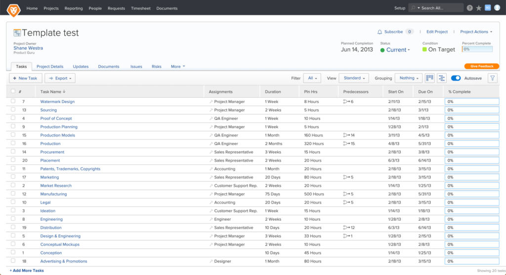
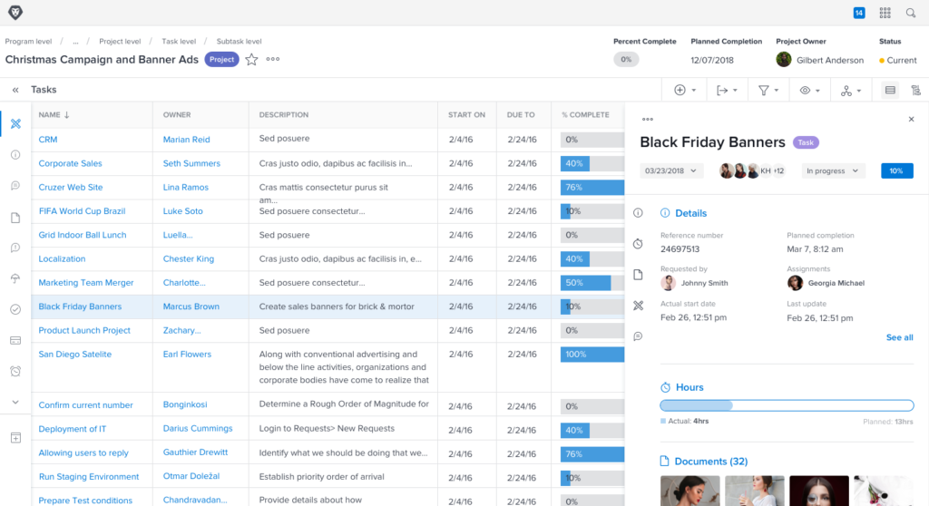
To show a little sneak-peek of how this design system has changed our product, use the slider below to see how far we’ve come.
With over 20 designers across the globe at Workfront, it became increasingly important to maintain a consistent style and visual language across all areas of the product. The initial outcome was to have a collection of reusable components, guided by clear principles and based off of Atomic Theory. These components would be designed to function harmoniously in simple and complex experiences.
My Role
Lead UX Designer
Duration
2018-2020
Company
Workfront
Deliverables
Design language
Components
Sketch Library
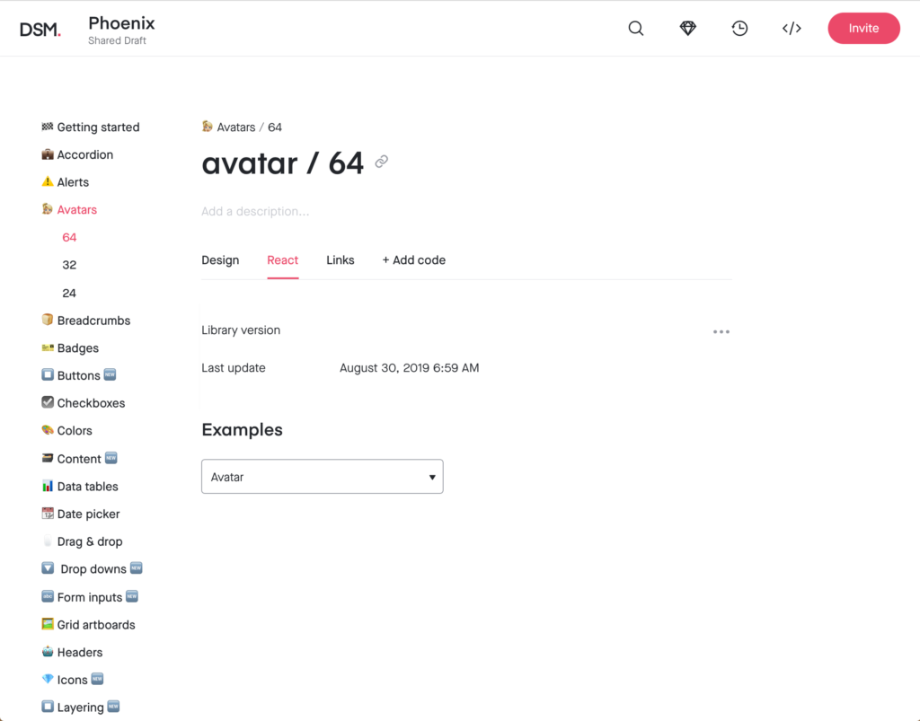
InVision DSM
Documentation
problem
As Workfront has grown over time, the areas of ownership and the amount of change and influence that have gone into these areas have not stayed consistent. Parts of Workfront are Frankensteined together, and you can tell by the appearance. In a push to become an enterprise ready software, Workfront needs to create a cohesive and visually consistent experience.
Project Timeline
Workfront’s Design System, named Phoenix (in a play on rising from the ashes…), is an ongoing effort, but to get it off the ground there were certain phases we had to roll out.

Stage 1 consisted of identifying stakeholders, assembling a team and selecting which team model our design system should reflect.
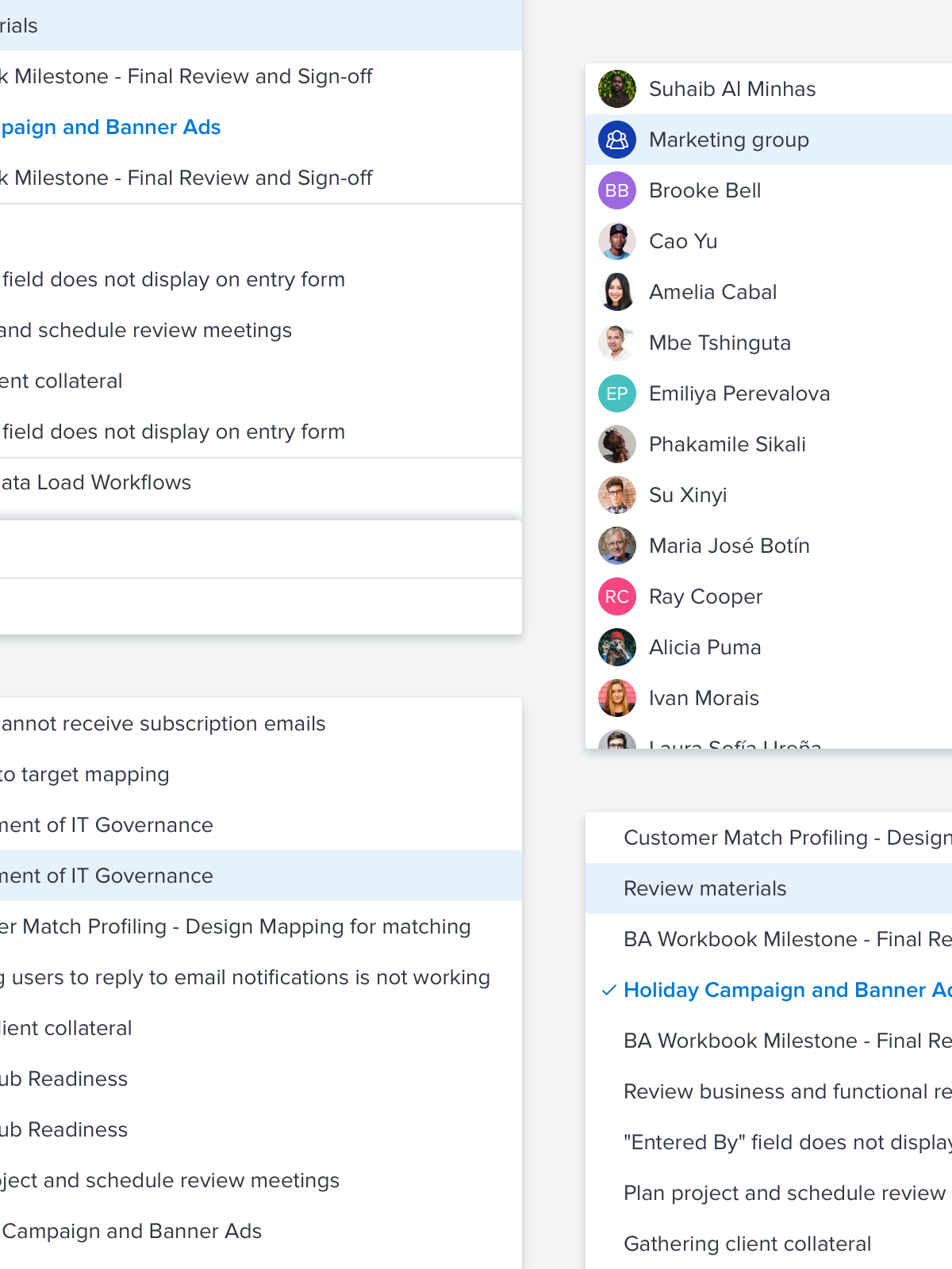
Stage 2 consisted of auditing the product for visual inconsistencies and discrepancies. Audits are performed frequently to continually update and maintain the library.
Stage 3 consisted of designing components and a shared design language for the product. Testing, internal review, and frequent iterations continue, well after the component has been designed.
Stage 4 is when engineering takes the designs and builds them into reusable components.
Stage 1: Identifying stakeholders
As I joined Workfront the groundwork for building a design system was happening with the push from our VP of User Experience, Wade Shearer. He eventually got buy-in from our CTO who both hand-picked the team known as Core Platform. I had expressed interest in helping run the design system and was a shoe-in. From here we built a team of engineers, QA and PM to start building our system.

Steve Zobell
CTO

Wade Shearer
VP of UX
Core Platform
UX, PM, Dev, QA, Research
Design System Team
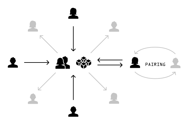
The Design System team model we’ve landed on is something between the Overlord and the Federated model (detailed by Nathan Curtis at 8 Shapes). The Core Platform team owns Phoenix, I have the final say on additions/changes to the design system and our team is responsible for maintaining it from a service perspective, but we allow contributors from other teams to help design and build components if we approve of the addition.
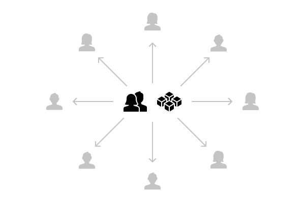
The Overlord model
The Federation Model
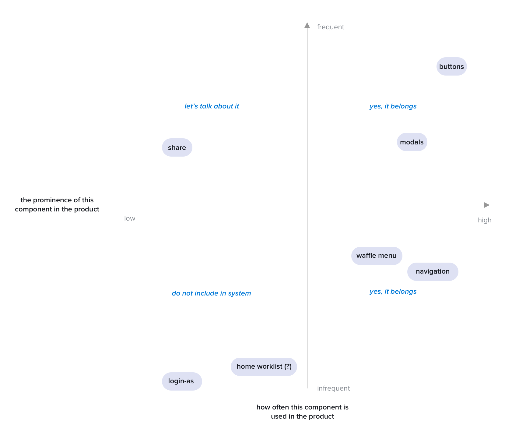
Does it belong?
Something I run into frequently is changes, additions and iterations of component requests. It was once a blurred-line between if it belonged and if it didn’t. I wrote up an entire monologue on how to contribute and if it belonged in the system–which to no-ones surprise, nobody read (I get it, people are busy). In an effort to make it easier to decide and teach the product org, I created our Phoenix Magic Quadrant:
Stage 2: Auditing
Auditing Workfront has been one of the most valuable practices we’ve used to help define, clean up and recognize inconsistencies in the product to date. I started this activity with help from one other UX designer in our Poland office. We sifted through the product taking hundreds of screenshots to compile into one huge audit to start.
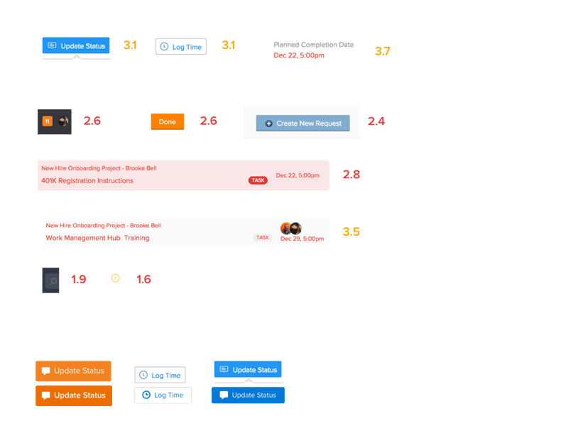
You can see some of the examples of varying components, icons, colors and typefaces. It was one of the things we took with us as we began selling the idea of a design system to the broader organization and receiving buy-in from our product counter-parts. We not only audited to begin this journey, but have started auditing Sketch files and production UI frequently to take back to engineering and QA to point-out discrepancies we’ve pinpointed in the product–helping keep the vision clear of why we’re doing this and the standard we hold ourselves to.
Stage 3: Design
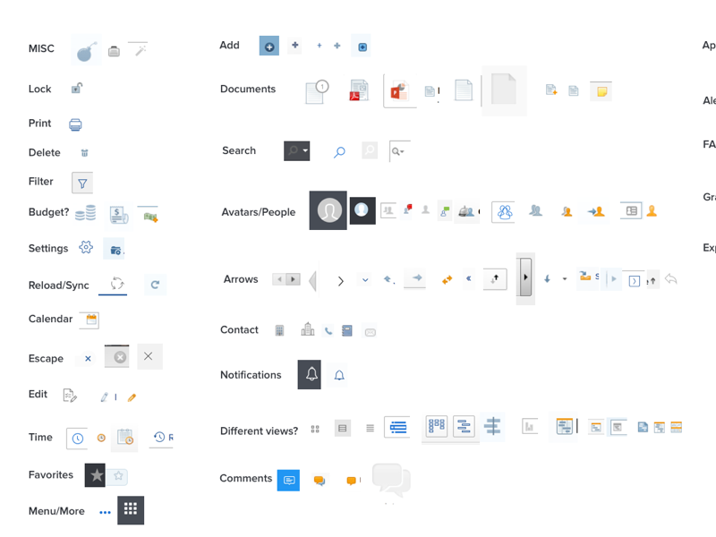
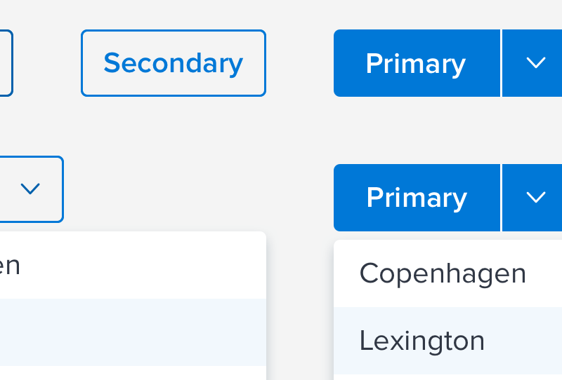
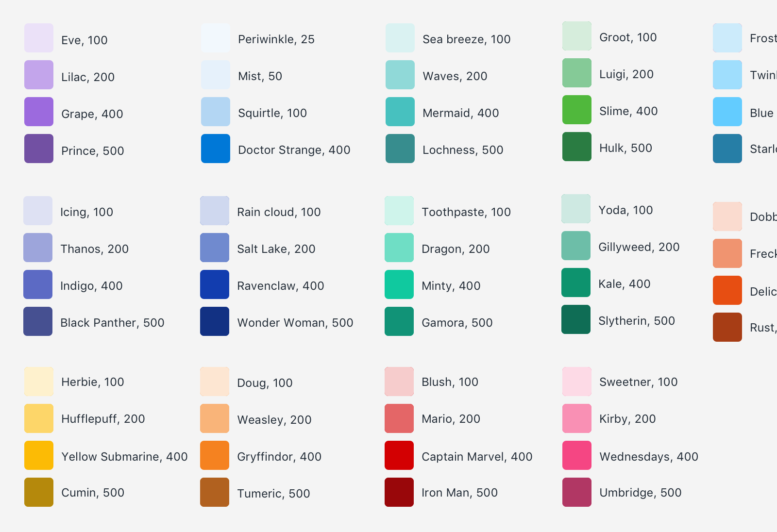
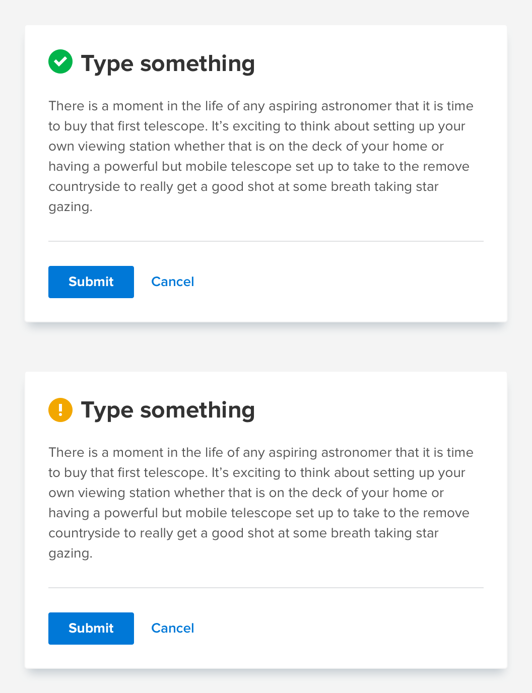
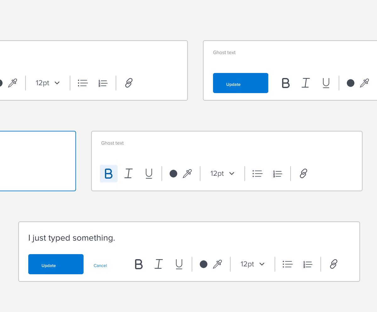
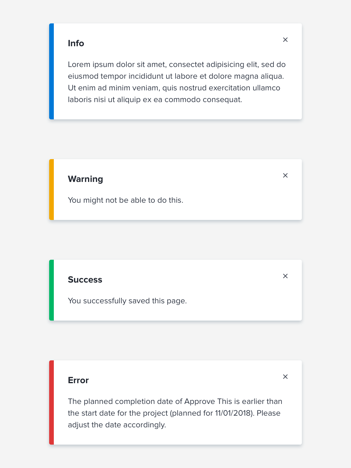
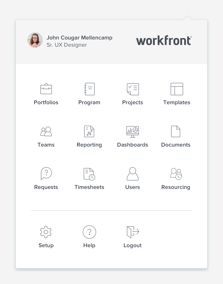
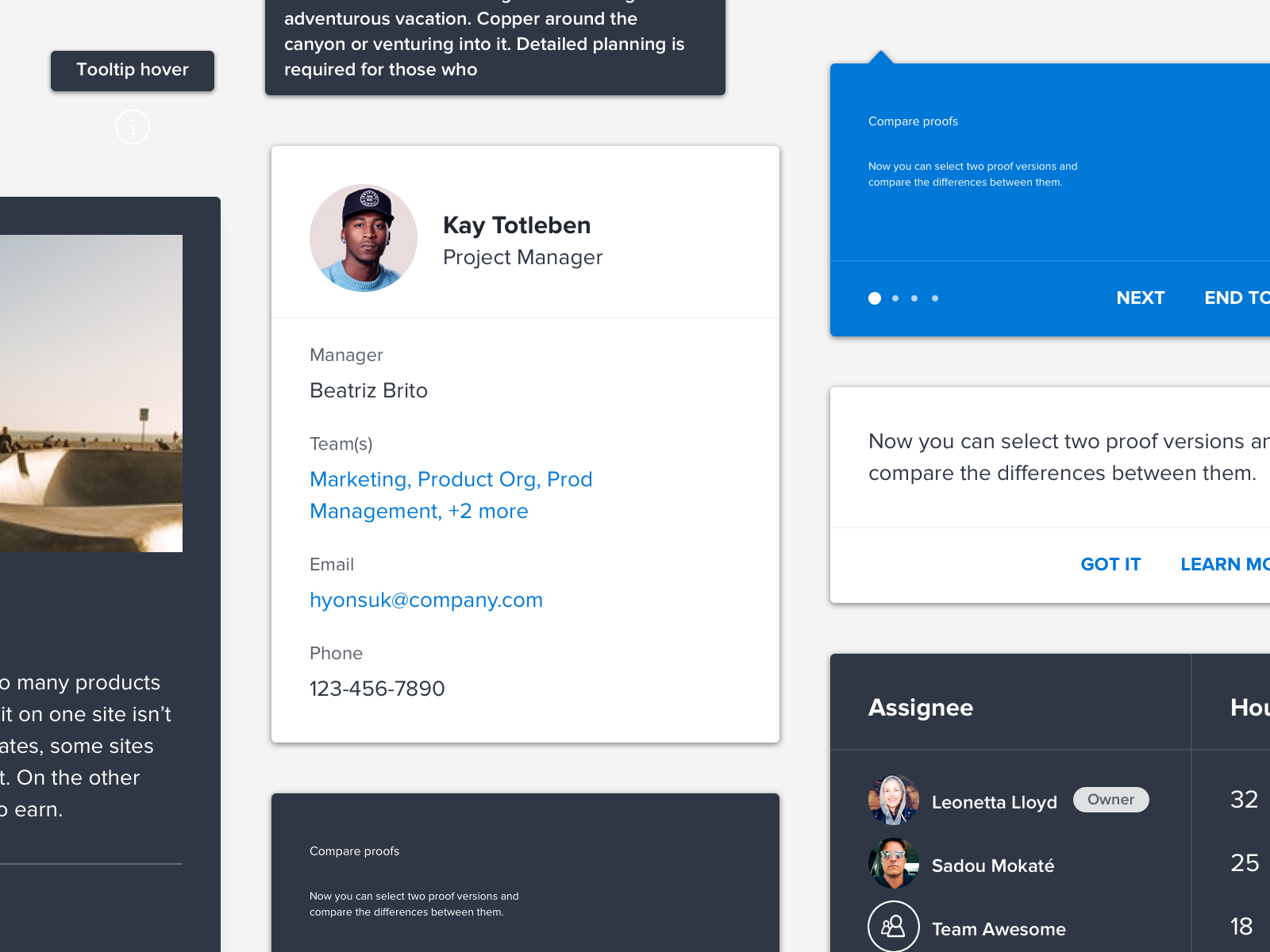
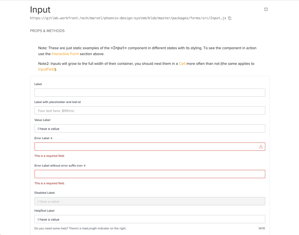
Once we audited the system it was time to begin designing the design system. A lot of our components were built on foundations of components we had in the product initially, but they were cleaned up, re-vamped and made visually more appealing. Some of the notable mentions would be we have begun building our components to be accessible to meet WCAG 2.1 compliance–many on our team (myself included) were sent to WebAIM’s accessibility workshop to be certified so that we could intentionally build our library. Another thing to note is that we designed and built over 100 components in less than a years time, servicing our product organization and while maintaining quality.
Stage 4: Building, iterating, and maintaining
While we’re still in this stage, we see Phoenix as a continual effort that will continue to grow and conform to what the product needs, acting as a service to the product and those that build/design it. We are in the process of amping up our internal and external library and hope to share what we’ve built with the community, eventually. We hold ourselves to a high standard and make sure everything we build and iterate on abides by our principles.
Our Principles
Is it consistent?
Every element, component and pattern created is designed to work elegantly together to ensure cohesiveness, consistency and commonality across the platform.
Is it flexible?
Phoenix components are designed to work seamlessly together, no matter the user’s environment, device or instance, it just works.
Is it delightful?
Phoenix strives to create experiences our users admire and enjoy. By doing diligent research upfront, understanding who our users are we design experiences that thrill and delight.
Is it compliant?
We design to suit the WCAG 2.1 guidelines to provide experiences for all users, no matter their ability or situation.
To serve our user’s we’ve employed several different tools over the course of this project. An internal monument site, Design System Manager and coming soon an external library.
Before and after
As of this writing, we will be moving to Adobe’s Design System Spectrum. We’ve learned a lot from this project and are excited to start building new components in Spectrum.