With the inception of our desktop Workspace home, we needed to understand how that might translate to our mobile application. We also wanted to better understand how our user’s use their mobile device for tracking, updating, communication, and finishing work.
My Role
Discovery & ideation
User research & validation
Design vision
Team
Brooke Bell :: UX Manager
Anna Balyan :: Sr. UX Designer
Vardan Aslanyan :: Product Manager
Elissa Lauber :: Sr. Researcher
analytics
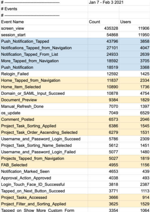
First thing I did when beginning this project was to better understand the current usage of our mobile app and which features were most used. Historically our mobile usage has been low and as an enterprise SaaS, we have put more time and effort into our desktop product. I really wanted to change that, with the pandemic changing the landscape of remote work, I felt it was even more important to tailor our app to being easy-to-use and answering the needs of flexible work.
Feature usage breakdown
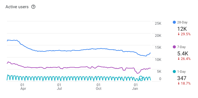
Pulling the analytics of the current mobile app showed us a few interesting things. User’s are typically pulled into our app by our notification system. User’s also spend most of their time in our Home work list section, where their tasks, new comments, and any other related work items are located. This tells me user’s are prompted by a notification to view a new work item, respond to a comment, or sorting through their work to find something specific (which tells me it may not be intuitive or easy to find work with this list).
Usage
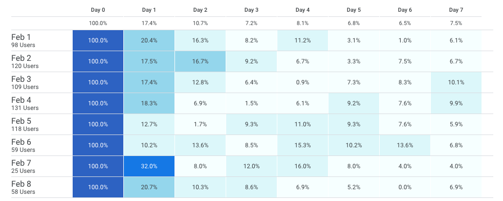
Next, I pulled analytics of retention of user’s to see when they drop off, this would help to understand if a first-time login was captivating enough to bring them back. Overall, it wasn’t and there is a significant drop in usage starting the second day. Also, understanding active user’s compared to year’s past to see if the pandemic had impacted usage of the mobile app, which it has, significantly. Lastly, a basic understanding of breakdown of device type, iOS being two-thirds of our usage.


Competitors
Once understanding better the current usage and the analytics of the current mobile experience, I set out to do some competitive analysis. There are several apps that serve user’s in daily tasks, work tracking, collaboration, etc. I turned to the google play store and the app store to read reviews of competitor apps to see what users’s enjoyed and disliked about their apps. I catalogued this information in a Notion page that included screenshots of the app, summaries of likes and dislikes, and app store ratings.
App store ratings
Monday.com :: 4.6/5
- Task board is clean
- Free trial
- “Check-in” and “Focus”
- Bright colors
- To-do lists
Asana :: 4.7/5
- Appearance
- Easy to maneuver
- Scheduling
- Easy to move items
Airtable :: 4.8/5
- Well designed
- Fast and easy
- Powerful
- Appearance

Trello :: 4.6/5
- Easy and intuitive
- Prioritization
- Personal & professional use

Workfront :: 2.2/5
- Not powerful enough
- Buggy
- Limited functionality
discovery
Following gathering data about our app and our competitors, I set out to speak with user’s of our competitor’s apps to better understand how they were using them, what they liked or disliked, and to better understand mobile usage for work.
Participants

Rebecca :: Fiji Water
Packaging Coordinator, Project Manager

Arleen :: Dell Technologies
Social Media Training Senior Advisor, Individual Contributor

James :: Abbvie
Technical Solution Architect, System Admin, Project/Work Manager

Leanne :: University at Buffalo
Medical Education Coordinator, Individual Contributor

Uzma :: Google
Customer Success Manager, Individual Contributor

Bryan :: Slalom Consulting
Consultant Manager, People/Team Manager
Themes & Findings
◦ User’s are using several apps to manage work
◦ Participants want to do simple things
◦ Communicating, schedules and tasks are vital
◦ Mobile devices are often used as secondary monitors while working remotely
◦ Usage of mobile devices has gone-down since the pandemic
◦ Syncing cross-device is important
◦ User’s are finding it hard to “leave work” since the pandemic
◦ Participants are using more collaborative tools since the pandemic
◦ “Where I work is more flexible” i.e. the couch, my bed, the grocery store
usability
Using our usability scorecard methodology, I tested with several user’s to baseline the current home experience in our app.
This testing uncovered several areas that needed improvement.
→ Sign in issues
→ Filtering is problematic
→ User’s don’t know what they’re looking at
→ Too unorganized to be clear what they need to do next
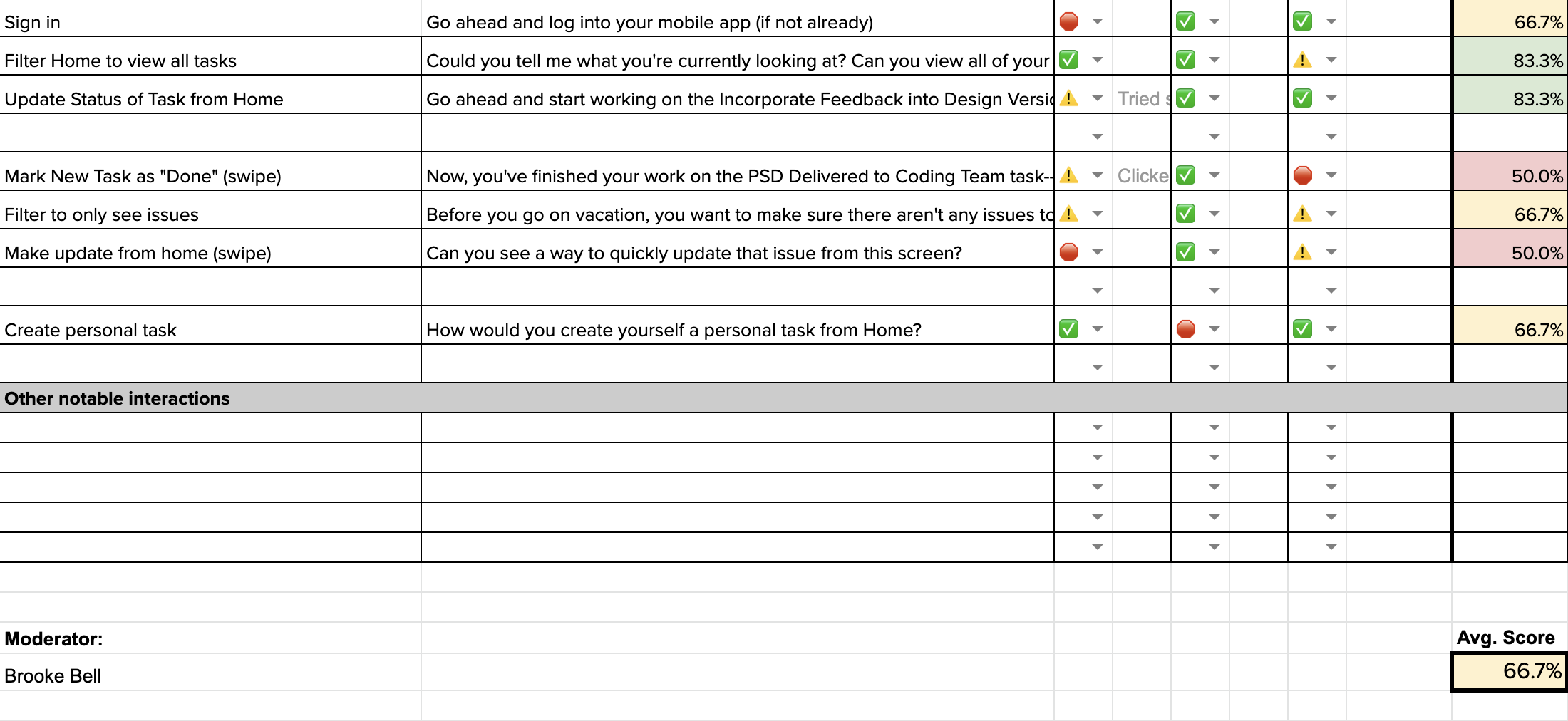
With an average score of 66%, the usability of the current experience is not meeting our user’s needs and is unusable. We strive to reach a score above 90%.
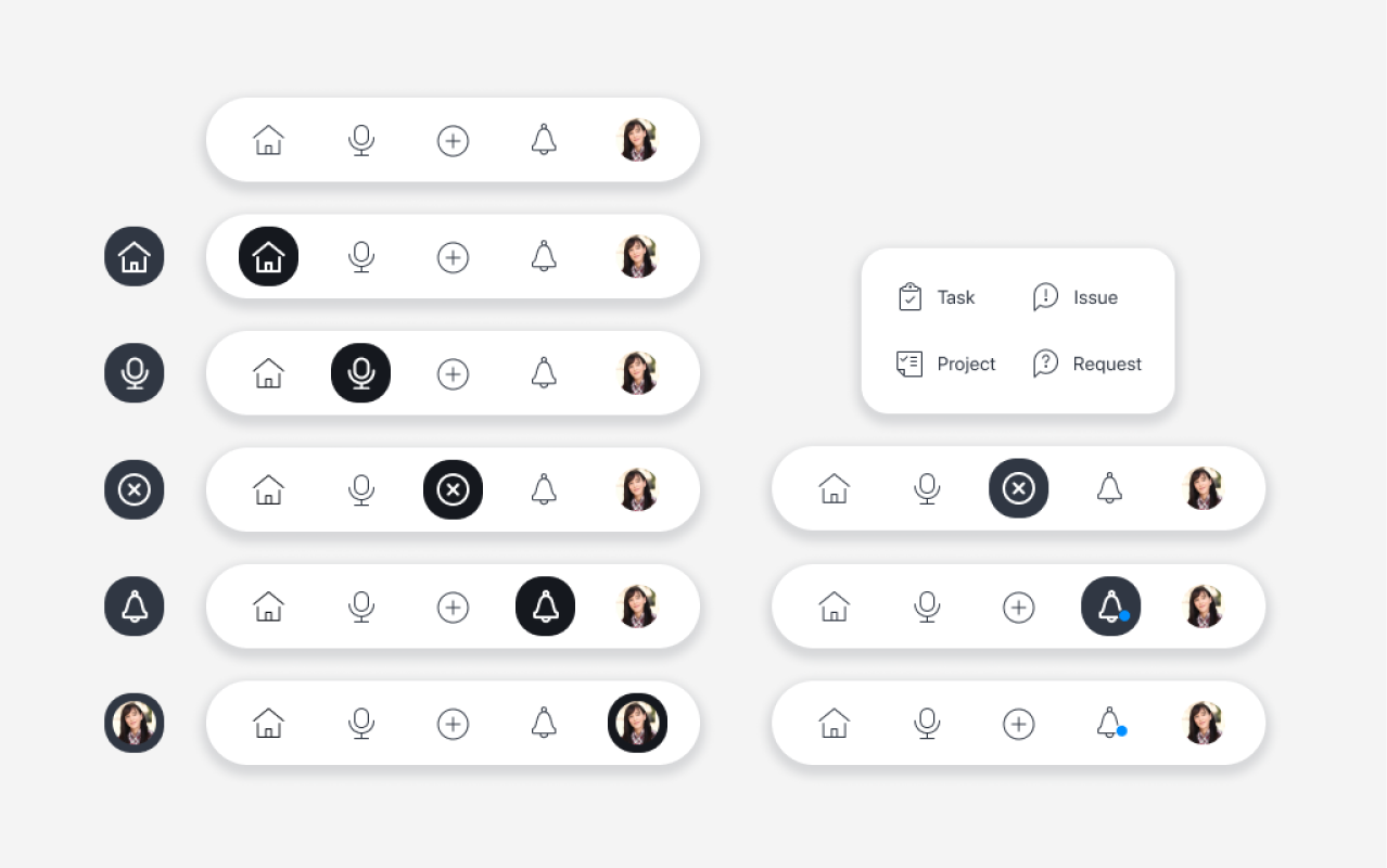
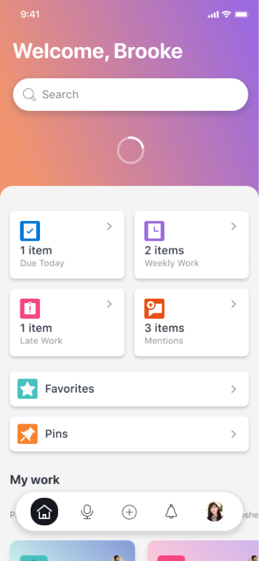
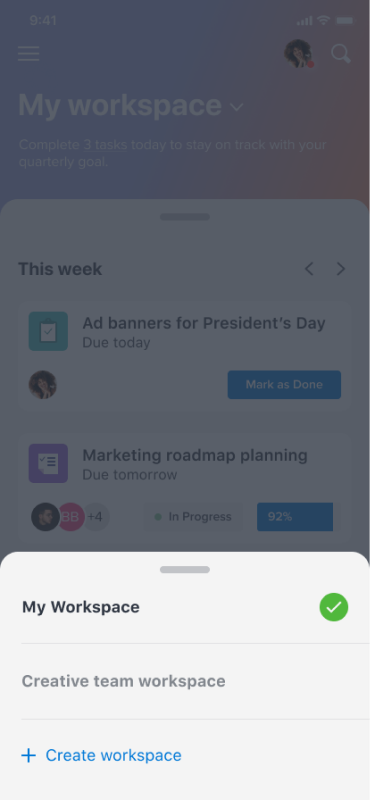
vision
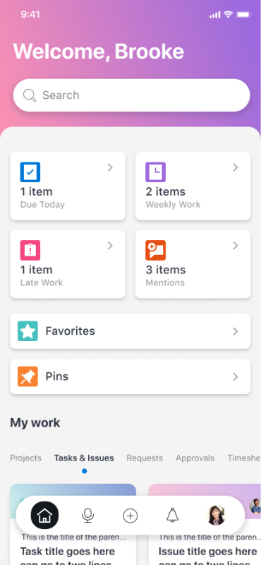
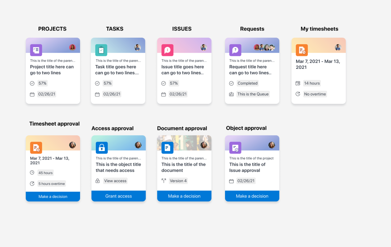
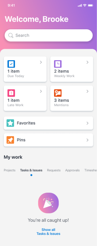
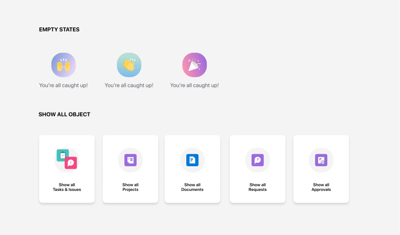
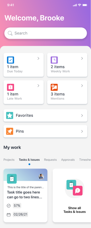
With enough information, I began working with our PM to start on a SLC (simple, lovable, complete) first version of mobile workspaces.


next
steps
With the first phase of the mobile workspace completed, we will continue to track and understand how these new features perform with our audience and iterate from there. Next additions will be to add in commenting functionality, customizable workspaces, additional object types, and reporting functionality.